Postproduction
Before you upload your video, we recommend adding some postproduction content such as name and title information for anyone interviewed, or an outro slide.
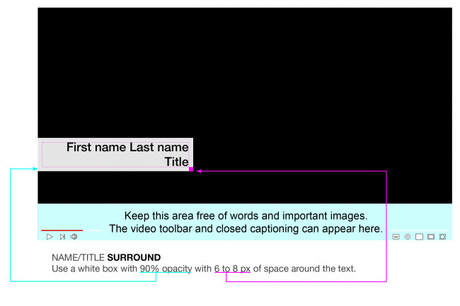
Video Name/Title Treatment

Name/Title Typography Specs
- Font: Helvetica Medium (or Arial Bold). Use upper and lowercase (not all caps).
- Size: Keep name and title the same size.
- Leading (the space between lines of type): Standard 120% (e.g. 18 pt/21.6 pt)
- Color: Black
- Surrounding box: Use a white box with 90% opacity with 6 to 8 px of space around the text.
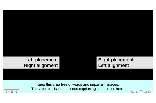
Name/Title Horizontal Placement
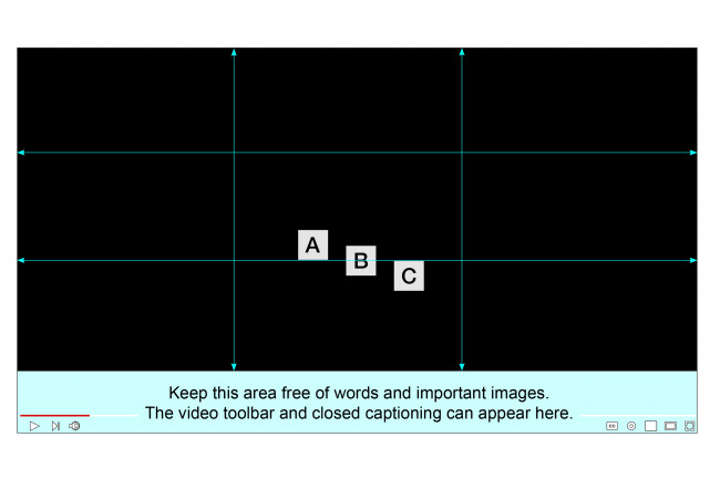
Name/Title Vertical Placement
Using the lower third gridline from the rule of thirds, place the name block:
A above the gridline
B centered on the gridline
C below the gridline
Video Intro and Outro Specs
Intro
Viewers decide within the first 10 to 20 seconds whether to watch a video all the way through, so you want to hook them with dynamic intro content. Make sure you have a good headline and description so that you can skip a logo or title and dive right in to your content! After that, show your most gripping points.
Outro
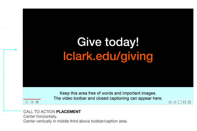
- Include a call to action. Make it clear to the viewer what you want them to do next (give, register, respond, or whatever). This is usually a direction statement followed by a short web address. Brief is best. If you need to request a go address, contact Morgan Stone Grether or Lawrence Siulagi.
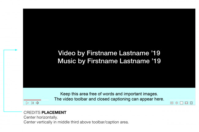
- Credits. Keep them clean and simple. Do not use scrolling text/crawl. Either dissolve between screens or reveal one line at a time.
Video by
Music by
Still Images by
- End the video with our logo slide. Download what you need from our video logo folder on Google Drive.
Outro Typography Specs
- Font: Helvetica Medium (or Arial Bold). Use upper and lowercase (not all caps).
- Size: Keep the same point size for all words.
- Leading (the space between lines of type): Standard 120% (e.g. 18 pt/21.6 pt)
- Color: Maintain good contrast, and think about readability on a phone. Stick to our brand colors: black, white, orange.
- Call to action placement: Center both horizontally and vertically.
Credits Typography Specs
- Font: Helvetica Medium (or Arial Bold). Use uppercase and lowercase letters (not all caps).
- Size: Keep name and title the same size.
- Leading (the space between lines of type): Standard 120% (e.g. 18 pt/21.6 pt)
- Color: White on black background or black on white background.
- Credits placement: Center both horizontally and vertically.

Communications is located in McAfee on the Undergraduate Campus.
MSC: 19
email communications@lclark.edu
voice 503-768-7970
Vice President for Communications
Lori Friedman