Fonts
By consistently using official typefaces—commonly referred to as fonts—in our materials, we unify communications across our schools and different platforms.
The two main fonts used in Lewis & Clark communications are Goudy Old Style (serif) and Helvetica Neue (sans serif). There are no free versions of these fonts available, and at this time, L&C does not have an institutional license. However, the fonts are not expensive to purchase (see below) and will help to keep your communications on brand. At a minimum, we recommend purchasing the Regular, Italic, and Bold weights in Goudy; and the Roman, Bold, and Italic weights in Helvetica.
If you are unable to purchase licenses for Goudy and Helvetica, please use Times New Roman in place of Goudy and Arial in place of Helvetica.
Purchase
You can choose between purchasing the font family or select individual font weights. Every license is for use on one computer.
Licensing 101
Unclear about why you are required to purchase fonts, and why they aren’t just available for free download? Here is a great font licensing 101 guide that explains intellectual property, what you’re really getting when you purchase a font, and how you can utilize fonts in your materials.
Installation Instructions
Font installation on a Mac Font installation on a Windows PC
Fonts in Action
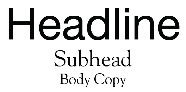
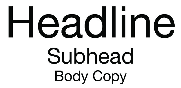
Choosing the right fonts can help your communication piece hit the mark. Combining our fonts and their weights in different ways adds depth and is useful for supporting our respective tones. The font size for subheads should be approximately half that for headlines. The font size for body copy—the main content of your piece—should be approximately one-third that for headlines.
Using exclusively Goudy Old Style creates a classic, strong impression.

Combining Helvetica Neue with Goudy Old Style creates a more casual, but still dignified, aesthetic.
Using exclusively Helvetica Neue creates a more contemporary, cheerful combination.

Communications is located in McAfee on the Undergraduate Campus.
MSC: 19
email communications@lclark.edu
voice 503-768-7970
Vice President for Communications
Lori Friedman